Annie Leibovitz: A Photographer’s Life

Credits: Photo by Annie Leibovitz, ‘Puffy takes Paris’, Vogue US, October 1999.
Tonight, I enjoyed the late night Thursday at the National Portrait Gallery to go to the Annie Leibovitz exhibition.
The exhibition, named A Photographer’s Life, mixes glamourous celebrity pictures with very personal scenes of Annie’s life, family and friends. There are many different styles: from landscape to close portrait, from black and white to colour, from political figures to athletes, from photoshopped, studio pictures to candids in Sarajevo, from Hollywood stars to Annie’s parents on holidays.
This exhibition has been reviewed quite a lot already so I will discuss it from a very personal point of view. A few interesting facts and impressions:
I did enjoy the diversity of styles. It enabled me to discover more of Annie’s work. However I think that there was so little coherence and consistency in the way it was displayed (not chronologically, not by style) that it was sometimes a little confusing for someone who is not particularly familiar with Annie’s work. I do think it was on purpose though since Annie picked the pictures herself for the exhibition and because she thinks they are all equally as important, and meant to bridge the gap between personal and celebrity. Maybe also because of the very nature of the gallery. Anyway, I personally like to understand the artist thought process, and that’s why I reckon more explanation and a clear path in an exhibition is often useful.
I did feel like a voyeur seeing all these nude, home or holiday pictures of Annie and her friends and family. The pictures of her close friend Susan Sontag facing cancer and death were moving but also uncomfortable. Most of all, I sometimes didn’t see the artistic expression that justified their presence in the exhibition. However some were really beautiful, such as black and white of Annie’s mother and daughter.
Very surprisingly, and as much as I am fond of black and white, my favourites were the colours. I found the colours so intense and deep, yet subtle and soft, never too bright, playing with the light and with so many shades, I cannot even describe how beautiful I thought they were. Some black and white were also amazing but overall the colours touched me the most. I thought they conveyed more life. Look at the picture above. Then imagine it in black and white. See what I mean?
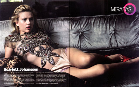
Finally, I deplored how few fashion pictures were displayed, which was obviously the part of Annie’s work I knew best and was eagerly expecting to see. The beautiful pictures of Kate Moss, such as the one above, from Vogue US, were missing. As were all the Disney and fairy tales inspired editorials. Still they are my favourites and that is why I chose to put this one, although it might not be the most relevant for a review of the exhibition. My favourite from tonight was then another grey-blue-shaded of Scarlett Johansson at Chateau Marmont, with gorgeous jewellery.
Overall I would definitely recommend this exhibition, it is so diverse that everyone shall find something to suit their taste. I am glad I got to know more of Annie’s work. I definitely understand why Vuitton asked her to shoot their campaign!
Post by Alize Morand.
About the Author (Author Profile)
I am Italian, from Florence. I am doing a MA at Soas, but on part time basis. At the moment I'm looking for a job...Subscribe
If you enjoyed this article, subscribe to receive more just like it.


I’ve seen this exhibition and it’s really stunning.